
Privacy-First Sign In
A sign-in page that states the promise up front: see where your time goes, without timers or surveillance.
These images are illustrations of the concept, not screenshots of the actual product.
Overview
The sign-in page is the first screen most people see in TimeCampus, and this concept uses it to set expectations before an account is even opened. Instead of a bare login form, the design pairs the form with a short, direct statement of what the product does and what it will not do: show where your time truly goes, without timers or surveillance.
Time tracking has a trust problem. Many tools depend on people remembering to start and stop timers, and others rely on monitoring techniques such as screen recording and keystroke logging that make people wary from the first click. The design addresses this at the door. Three short value cards sit under the headline: automatic recording of activity across tools, respect for privacy with no surveillance, and deep, actionable insights. Someone signing in for the first time, or returning after a while, is reminded of the terms on which their time data is meant to be used.
The illustrated layout splits the page in two. On the left, a large headline, the three value cards and two calls to action, Learn More and Get Started Free, speak to newcomers. On the right, a frosted Welcome Back card carries the sign-in form: an email address field, a password field with a Forgot Password link, a Remember me checkbox and a Sign In button. Below a divider, a row of buttons offers sign-in with an existing Google, Microsoft, Apple or GitHub account. The top bar keeps a search field with a keyboard shortcut hint alongside Sign Up and Sign In buttons, and a slim icon rail on the left previews the main areas of the app.
Signing in leads straight to the home dashboard, where today's tracked time, billable hours and active timers are summarized. The privacy framing introduced here carries through to the consent and personal-boundary settings described in other concepts, so the promise made at the door is one the rest of the product is designed to keep.
What this concept shows
- A headline that states the product's promise: seeing where time goes without timers or surveillance
- Three value cards covering automatic capture across tools, privacy with no surveillance and actionable insights
- An email and password sign-in form with Forgot Password and Remember me options
- Single sign-on buttons for Google, Microsoft, Apple and GitHub accounts
- Learn More and Get Started Free calls to action for people new to the product
- A top bar with a keyboard-shortcut search field and separate Sign Up and Sign In buttons
How it works
- Arrive on the landing page and read the headline and the three value cards that explain how time is captured and how privacy is treated.
- Choose Learn More to read about the approach, or Get Started Free or Sign Up to create an account.
- If you already have an account, enter your email address and password in the Welcome Back card, optionally ticking Remember me.
- Alternatively, pick one of the single sign-on buttons to sign in with an existing account.
- Use Forgot Password to recover access if needed, then sign in and land on the home dashboard.
Who it's for
- Individuals who want to understand their own time
- Knowledge workers wary of monitoring software
- Team leads evaluating a time tool for their team
- Freelancers and consultants who bill for their time
Illustrations
1 illustration of this concept. Select one to view it full size.
Landing Page With Sign-In Card
This illustration shows a dark, two-column landing page with a soft aurora glow behind the content. The left column opens with a large headline about seeing where your time truly goes without timers or surveillance, followed by three stacked cards, each with an icon: automatic recording of activity across tools, respect for privacy with zero surveillance, and deep, actionable insights. Learn More and Get Started Free buttons sit beneath them. The right column holds a frosted Welcome Back card with email address and password fields, a Forgot Password link, a Remember me checkbox, a full-width Sign In button and, under an "Or sign in with" divider, four identity provider buttons. A top bar carries the product logo, a search field with a keyboard shortcut hint and Sign Up and Sign In buttons, while a narrow icon rail runs down the left edge.
Topics
- privacy-first time tracking
- time tracking without surveillance
- time tracker sign in
- automatic time tracking login
- single sign-on time tracking
- time tracker without screen monitoring
- track time without timers
- privacy-respecting productivity app
Related concepts
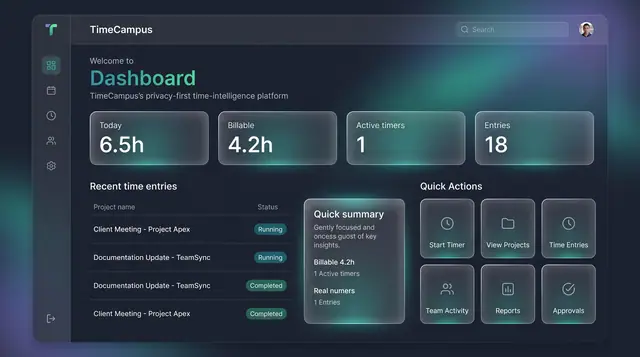
Home Dashboard and Custom Widgets
A home screen that sums up today's time at a glance, plus a widget board you assemble from the cards you care about.
2 illustrations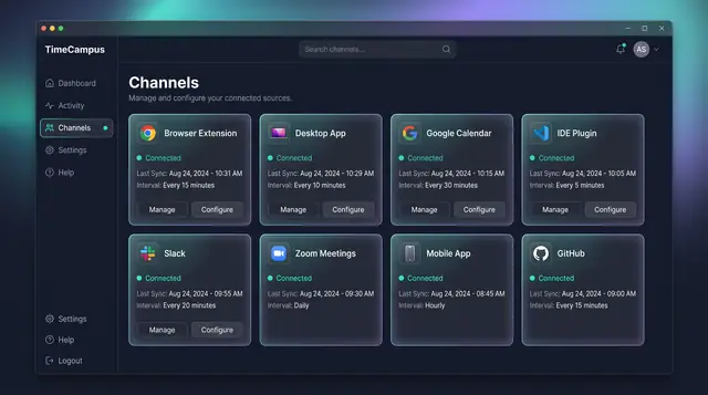
Automatic Capture Across Every Source
Connect your browser, desktop, calendar, editor, chat, meetings, phone and code host once, then let time capture itself.
4 illustrations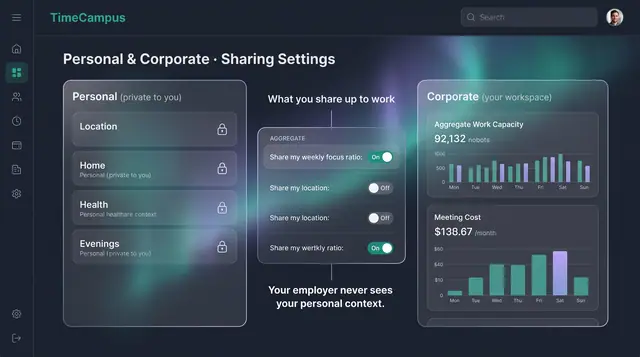
Privacy, Consent and Personal Boundaries
Decide what is captured, how long it is kept, and exactly what crosses from your personal life into your workspace.
3 illustrations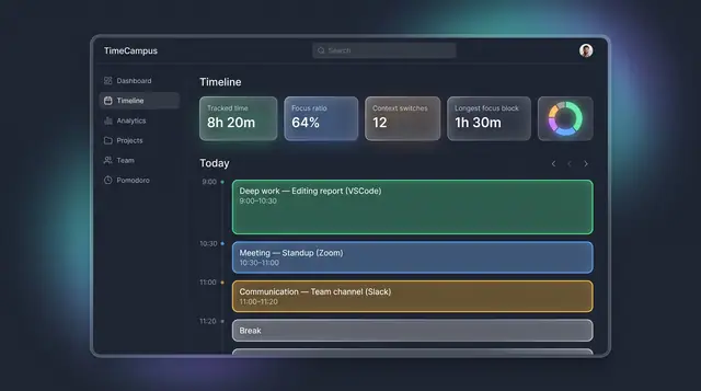
The Self-Assembling Timeline
Your day, assembled from every source into categorized blocks, with suggested projects you can accept or reject.
3 illustrations