
Personal Analytics and Reports
Turn captured time into trends, time distribution and project totals, then export the findings as ready-made reports.
These images are illustrations of the concept, not screenshots of the actual product.
Overview
Personal Analytics and Reports is the layer that turns a captured day into something a person can act on. TimeCampus assembles time from the tools already in use, and this concept is about reading that record back: how focus has trended over a month, how hours split between meetings, deep work, communication and breaks, how often attention moves between contexts, and where the hours actually landed by project.
Most time tools stop at a total. A number of hours tracked answers an accounting question but not a working one, and the moment somebody else needs the answer — a manager, a client, a finance team — the data has to be re-cut by hand in a spreadsheet. This concept addresses both halves: an analytics surface for the person whose time it is, and a set of prepared reports that can leave the product without anyone rebuilding them from scratch.
The illustrated experience moves from exploration to export. The analytics view opens on cross-cutting personal analytics with a scope selector, a trend chart plotting focus over a thirty-day window, and a stacked distribution chart breaking tracked time into activity categories. A right-hand column keeps the summary figures in view — a focus ratio, a context-switching measure and a ranked list of time by project with proportional bars. The reports view then presents the same underlying record as a stack of report cards, each with a title, a one-line summary of what it found and a download control, with a small inline visual on the cards where a chart makes the point faster than a sentence.
Within the wider product these two views sit between capture and everything downstream. The same record feeds focus scoring and work-pattern signals, project and task rollups, timesheet review, and the client-facing portal — so a figure seen in a personal chart is the figure an approver or a client would see, rather than a separate number assembled for the occasion.
What this concept shows
- A cross-cutting analytics page with a scope selector for choosing which set of analytics to view
- A productivity trend chart plotting a focus score across a selectable thirty-day window
- A stacked time-distribution chart with segments for meetings, deep work, communication and breaks, each segment labeled with its value, and a category legend
- Summary cards for the focus ratio and for a context-switching measure, kept beside the charts
- A time-by-project list ranking projects by hours with proportional bars
- A reports library of prepared report cards, each with a plain-language summary of its finding
- Inline visuals on individual report cards — a billable-versus-non-billable bar with an hours axis, and a focus-score gauge
- A per-report download control for exporting to a spreadsheet-friendly file, and a refresh action for the whole library
How it works
- Open the analytics view and set the scope and time window for the period to examine.
- Read the trend chart to see how focus has moved across the window rather than on a single day.
- Break the same window down by activity category in the distribution chart to see where the hours concentrated.
- Check the summary cards for the focus ratio and context-switching measure to sanity-check the picture.
- Scan the time-by-project list to see which work absorbed the hours.
- Move to the reports library and pick the prepared report that answers the question being asked.
- Download the report for sharing, or refresh the library so the summaries reflect the latest captured time.
Who it's for
- Individual contributors who want an honest read on where their week went
- Freelancers and consultants preparing billable-hours evidence
- Team leads reviewing effort against projects
- Operations and finance staff who need exportable time data
- Managers of remote teams planning around real workload
Illustrations
2 illustrations of this concept. Select one to view it full size.
Cross-Cutting Personal Analytics
This illustration shows an analytics page titled for cross-cutting personal analytics, with a scope dropdown at the top right and a slim icon rail on the left for home, analytics, the timer, calendar, people and settings. The main column carries two cards, each with its own period selector. The upper card charts a focus score across a thirty-day axis as overlapping trend lines on a scale from twenty to one hundred. The lower card is a stacked bar chart of time distribution, each bar split into segments for meetings, deep work, communication and breaks, with the value printed inside every segment and a legend beneath. A right-hand column holds a focus-ratio summary card, a context-switching percentage card, and a time-by-project list in which each entry pairs a duration with a proportional bar. All names and figures are sample data.
Prepared Reports Library
Here the concept shows the reports library as a vertical stack of cards inside the app shell, with a left navigation list for dashboard, time tracking, reports, team and settings, a search field, an account avatar and a notification bell. The page heading sits beside a refresh action. Each card carries a report title, a single-sentence summary of what the report found, and a download control for a spreadsheet-friendly export. The visible cards cover a tracked-hours summary for the month, a billable-hours report with an inline horizontal bar comparing billable and non-billable hours against an hours axis, a work-pattern analysis naming a peak productivity window, a focus-score report with a small gauge, and a project budget-versus-actuals card, with a further budget report beginning below the fold. Every figure and name shown is sample data.
Topics
- personal time analytics
- productivity trends dashboard
- time distribution by category
- time by project report
- billable hours report
- focus score report
- context switching metrics
- export time data to CSV
- work pattern analysis report
- project budget versus actuals
- time tracking summary
Related concepts
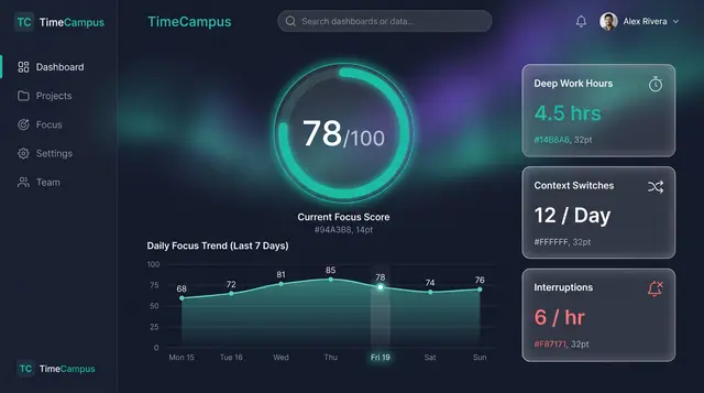
Focus Score and Work Patterns
A single focus score, the deep-work and interruption figures behind it, and the weekly rhythm that explains both.
2 illustrations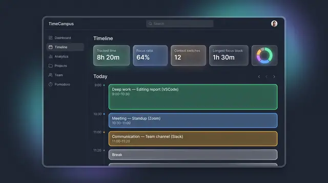
The Self-Assembling Timeline
Your day, assembled from every source into categorized blocks, with suggested projects you can accept or reject.
3 illustrations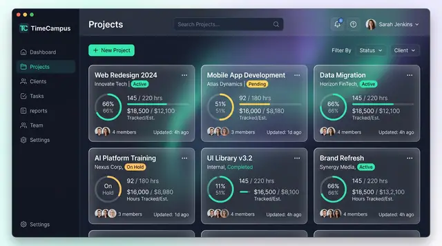
Projects and Tasks
Projects, budgets and task lists tied to the hours actually spent, so progress and burn are read from the same record.
3 illustrations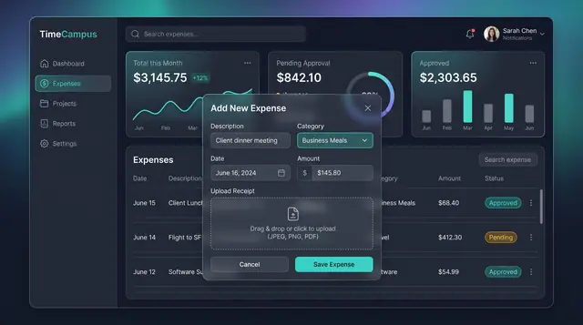
Expenses, Timesheet Approvals and Review
Log expenses with receipts, approve or reject submitted timesheets, and settle questions in a review thread beside the work.
3 illustrations